

Chromatic Biophilia: What can we learn from the color of Mexican Landscapes?
“Nature abhors the commonplace [...]. Variety she will have / harmony she insists upon / positivism she only employs to emphasize her love of the infinite”
Chromatic Biofilia is a series of experiments to find an in-depth understanding of color interaction using pleasing compositions found in nature that could be useful for Product Design. By a hands-on research approach, we found inspiration on the experiments by other designers and theorists as Emily Noyes Vanderpoel, Odgen Roods, Josef Albers, Joop Beljon, or Hella Jongerius. By replicating and re-interpreting these experiments, we present a collection of reference material to embody our observations of the relationship between color, nature, and surface. Designers could find inspiration in this work and re-interpret nature.
1-source images


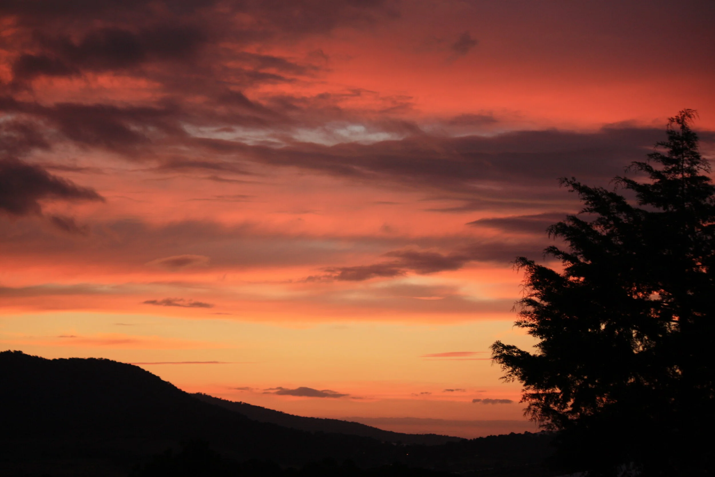


Landscapes of different Mexican ecosystems.
One of the initial research questions was to find a reason why Mexican culture is so associated with color. Our research found out that the relationships between the meaning of things and color become part of our context and cultural knowledge, generating a feeling of familiarity with them. According to theories of hedonic value in memory, it is claimed that repeated exposure to a stimulus is sufficient to improve one's attitude towards it, eventually increasing the pleasure caused by more familiar colors.
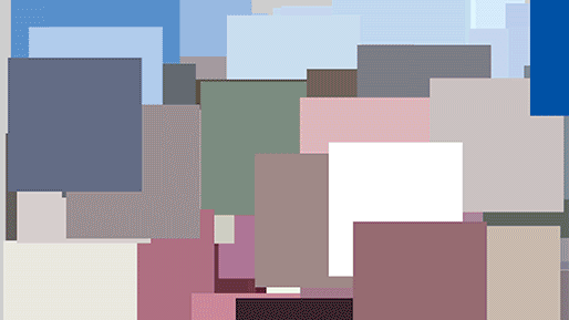
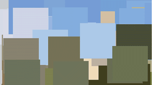
2-Colour PaletTe


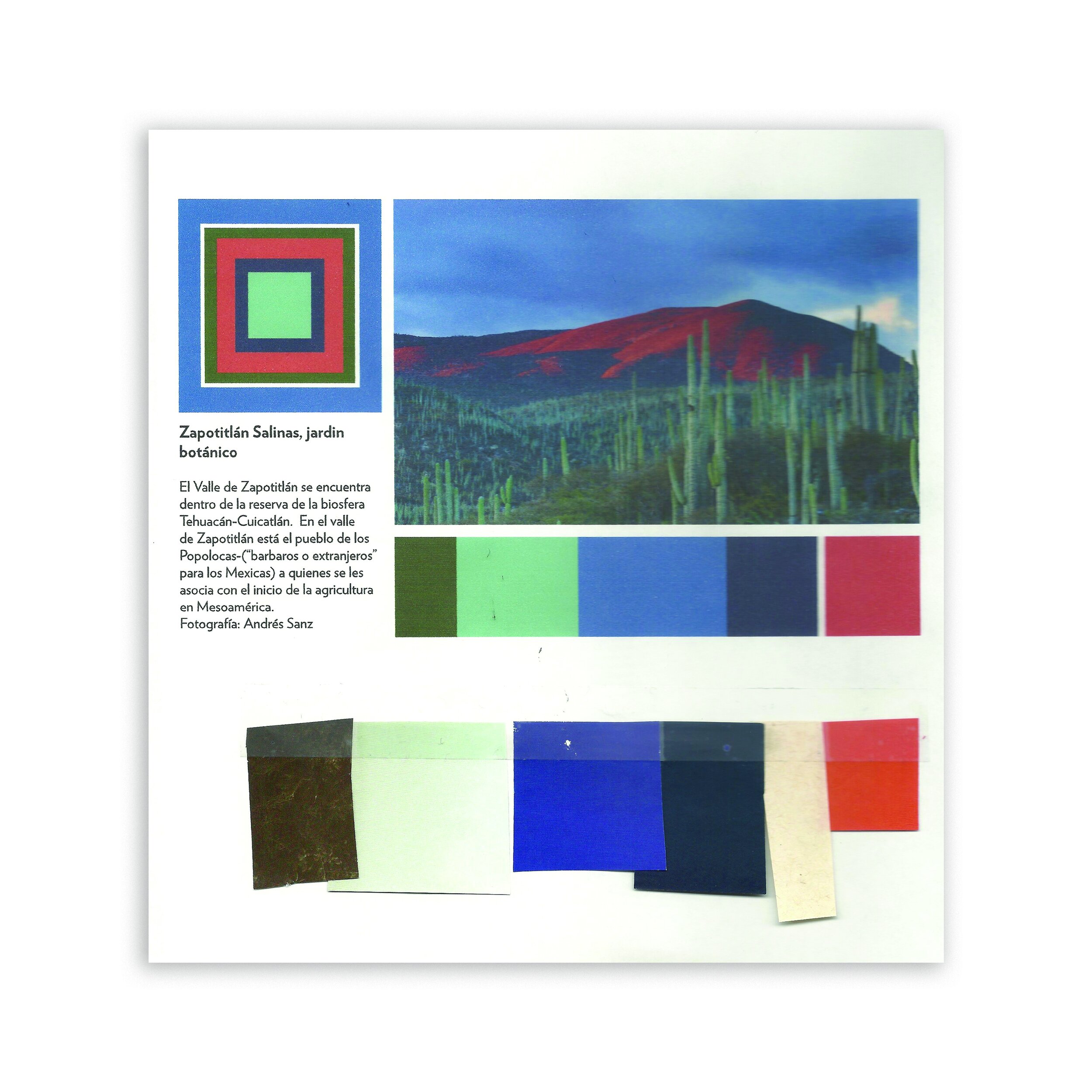


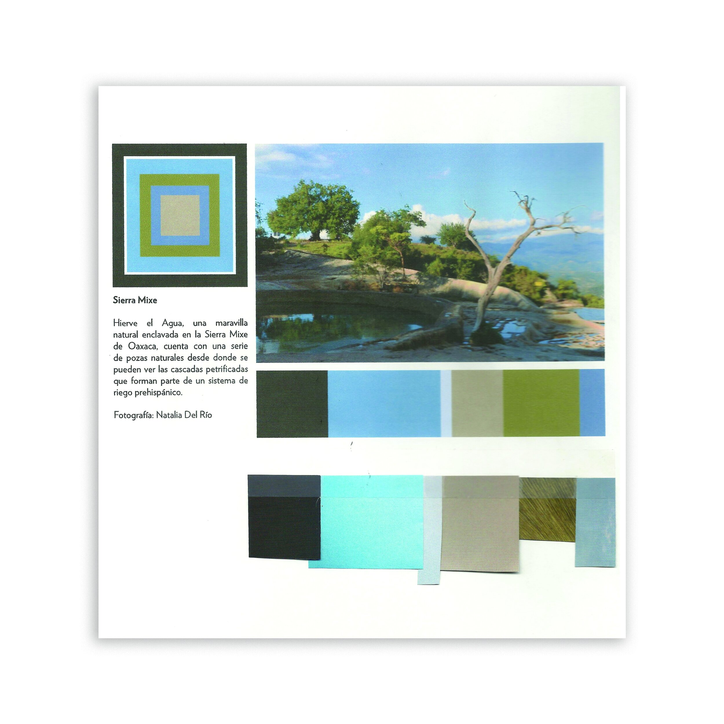


By studying the color proportion on every image, we designed a color palette to find the most harmonious combination using different palette composition. Afterward, we matched these color palettes with paper cuttings. We picked three of our favorite palettes to continue this experiment.
3-Animations
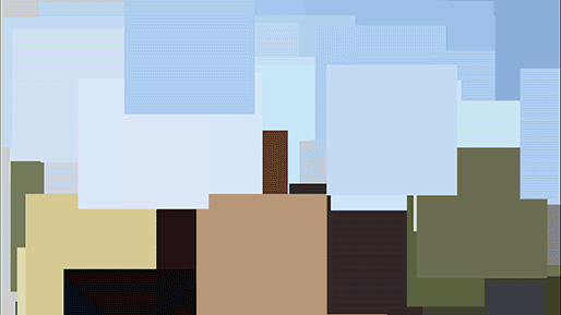
To find a more pragmatic way to abstract the color of our favorite images, we generated digital animations to deconstruct the color composition. These animations function as an artificial "second opinion" of our previous exercise.
4-Volumes

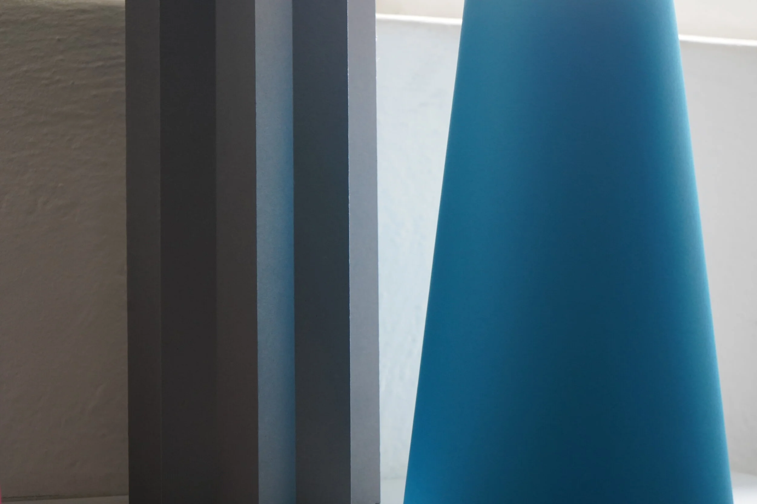
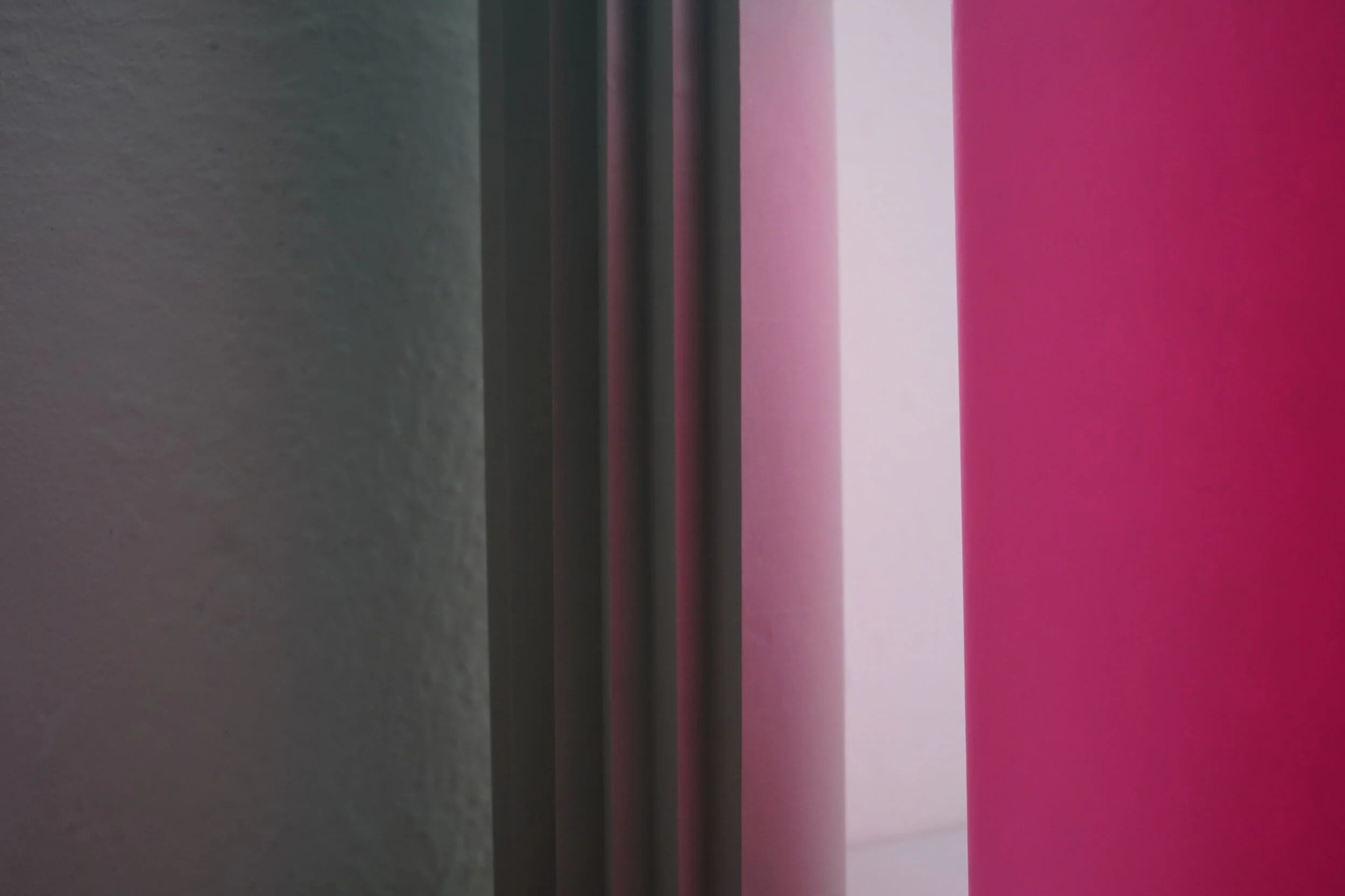
To understand each color palette’s interaction on different surfaces and volume, we proceeded to build paper prismatic volumes in various sizes and configurations. Then we played with them to find the most stimulating effects on light incidence and reflection.
5-Graphics
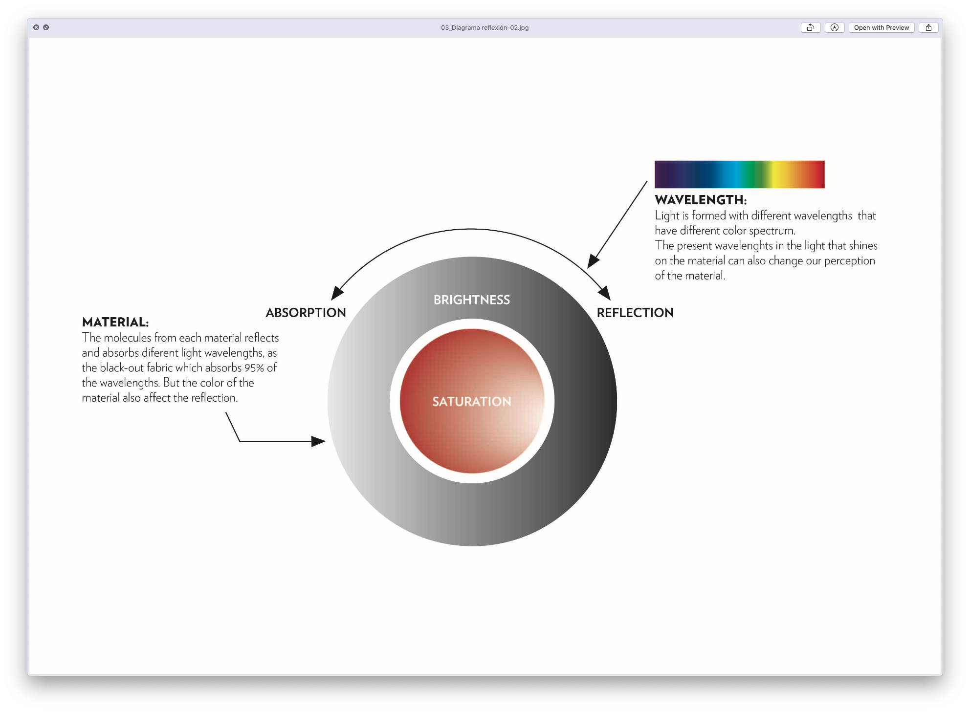


We designed some graphics as a process to understand our favorite color phenomena better.
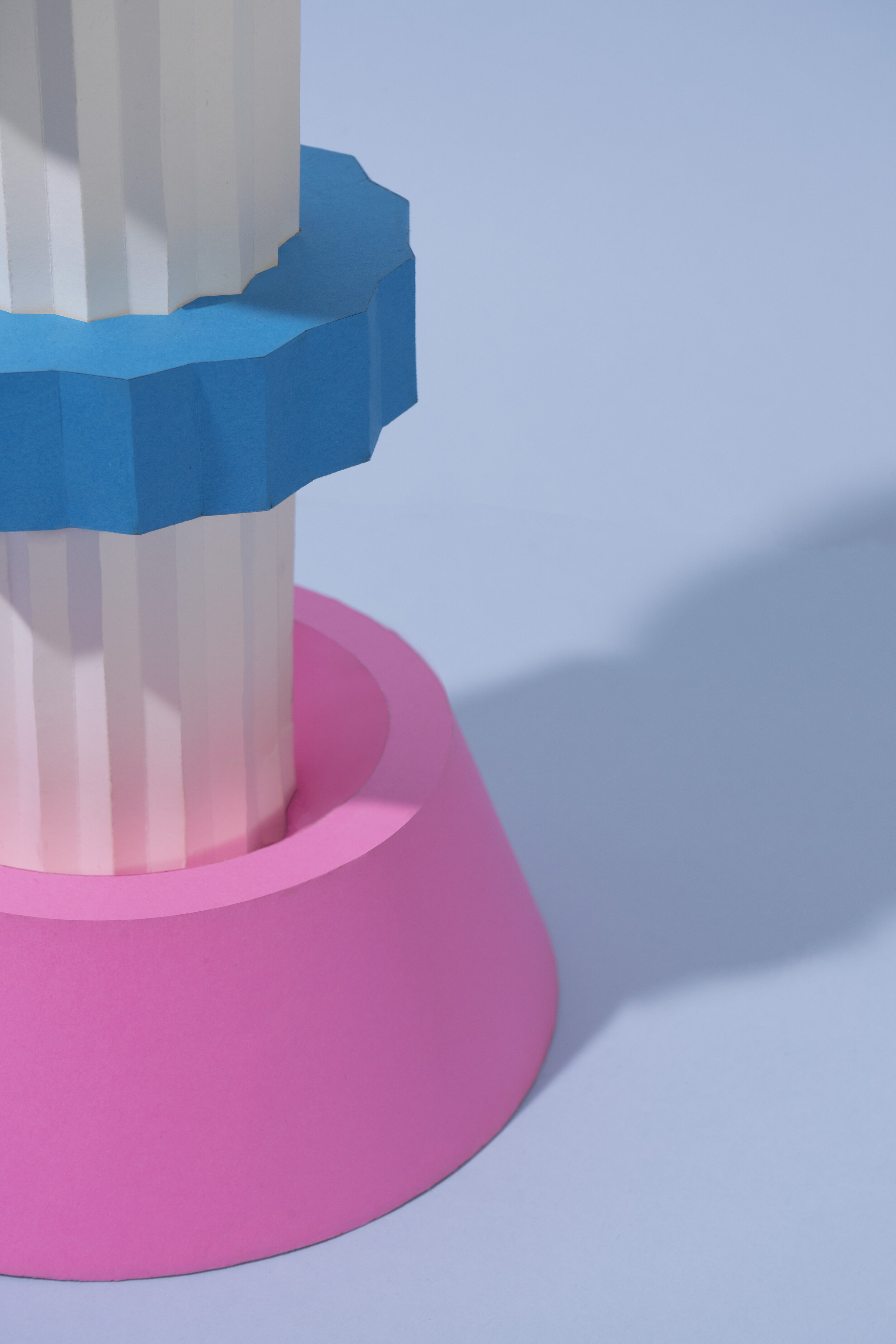
6-Volumes on environment.


Next, we made many different volumetric shapes to analyze the reflection of light and incidence with each other and its environment.
7-White Totems

After identifying the more exciting phenomena on incidence and reflection, we designed several anthropomorphic totems on white to replicate and enhance our preferred umbrae and brightness.
8-Color Totems


For our concluding experiment, we designed three anthropomorphic totems. Each totem functions as a volumetric catalog for referencing how every color of each palette reacts and interacts on different surfaces, umbrae, and lightness.
Creative Direction: José de la O
Production Team: Andrea de la Peña, Diana Delgado, Natalia del Río, Adriana Gutiérrez & José de la O.